By Melanie Kinney, Content4Demand
Recently, Contently posted an article titled “The 5 Keys to Better Interactive Content.” One lesson in particular caught my eye: Lesson three.
I don’t want to sound like a hater, but here’s a hard truth I’ve discovered working with both editorial and marketing content creators: Hacking long-form content into interactive experiences doesn’t end well.
The problem is that when you start with an existing long-form piece, it’s hard to let go of all those words. They cling to you, begging to be spared the heavy wrath of the delete key. These projects tend to be too text-heavy, which makes for a much weaker user experience. You layer on some bells and whistles on top of a traditional narrative. It’s long and clunky and awkward. It just doesn’t work.
I’m going to challenge this theory by adding an asterisk. Long-form articles don’t work as interactive content *unless you choose the right platform.
First, lets define “traditional long-form content.” In the B2B world, we publish a lot of white papers, survey reports, E-books, checklists and best-practices guides. These formats typically have multiple pages, high word counts and some design elements throughout. Despite being wordier than other offerings, these long-form pieces do have a place in the digital world.

The original lesson 3 mentions that long-form articles are “too text-heavy,” making a weaker experience for the user. Yet people read long-form content digitally all the time. When was the last time you read a book on your tablet, read a news article on a website or delved into your favorite blog? Okay, maybe a blog isn’t technically “traditional,” but books and news articles are. They’ve adapted, and so can your content.
Choosing the right platform is the key here. We need to be careful not to try and squeeze a true long-form piece into a place where it doesn’t fit. For example, a white paper is not going to work as an interactive infographic. In my experience, white papers can’t even be translated into more visual E-books. The copy and content is important — so you need to keep it all.
What I’ve found work best are custom HTML5 articles. These pieces are built using a combination of HTML5, CSS3 and JS. Images, GIFs, videos, SVG paths and more can be used to enrich the content.
The Verge articles were a huge inspiration for me when I started looking into this a few years ago. In fact, they have a whole section dedicated to long-form articles. These article are long and creative. Including some interactive touches, such as imagery and videos, makes the experience more engaging. By the looks of it, The Verge isn’t cutting their word count; they’re just designing the content more effectively.
Check out this Polygon example. To enhance the content, Polygon includes imagery, videos and SVG paths. Polygon also includes a navigation bar (also known as a “table of contents”). I can skip around to different places in the article if I so desire. It’s a great example of what can be done with long-form content on the web.
So, what are some important things to think about when creating traditional long-form B2B content on the web? Take a look at lesson 3.2.
![]()
Content comes first. In the B2B world, that’s something designers have to live by — hard as it may be! Is it a huge plus if the design fits seamlessly with the content? Of course, but what I’ve learned is that the content is the main focus here. We need our audience to actually read the content our team is producing, and that means we’ve got to design it accordingly.
Here are some tips:
Collaborate. During these projects, designers, developers, marketers and editors all are touching the same piece. Having so many hands in the same pot can be daunting. Kick off the project with a 30-minute brainstorming meeting to get everyone on the same page. I ask the editors to provide a short outline prior to the meeting, and I come up with a project timeline. From there, we discuss the topic and dream up creative/interactive things to include based on the content. In the end, the whole team is moving forward with one design concept.
Embrace the TOC. Take the table of contents into the 21st century with you. In the web world, we call a table of contents a “navigation bar.” But rather than just showing the different sections and page numbers, we can link all the content together, so users can jump to different sections at a moment’s notice. We accomplish this using anchor links.

Increase your font sizes. When dealing with long-form content, your content needs to be readable. Design your paragraph tags to be at least 1em (16px). Another thing: Don’t use true black on white. Try a dark gray instead so there’s less contrast. (Something like #474747) Finally, don’t be afraid to use letter spacing. You’d be surprised what .5px can do for the eyes!
Choose background images wisely. Background images are great, but we have to remember what they are…background images. The images should be relevant to the content, but they also need to blend into the background. When you’re overlaying chunks of copy, you want these to be an accent rather than a focal point.

Don’t get sloppy with animations. Animations are great elements to include in digital content, even emails! The problem is, we sometimes overuse them, making our pieces look sloppy and overwhelming. For long-form content especially, it is important to keep your animations subtle. Use them when you want to call attention to a specific callout or stat. In this case, less is more.
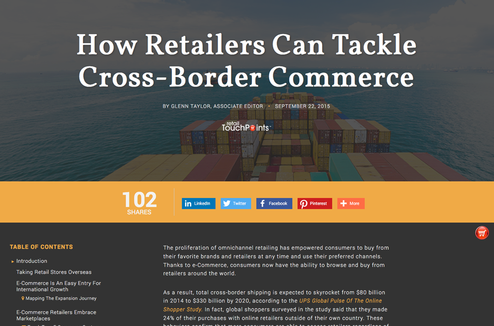
Check out this example from Retail TouchPoints. They’re using subtle animations within the whiteboard elements. (And it includes a navigation bar!)
Be Creative. Something as simple as changing a bulleted list into a series of images/copy can really liven up your content and break apart your copy. Doing this will also call attention to these snippets when users are scanning the content.

Be Innovative. Think of new and fun ways to present your content other than just flowing copy from the top down. Demand Gen Report has published a State Of Marketing Automation Outlook Guide every year, traditionally as a PDF. This year, they did an HTML5 article instead. Take a look at the layout. Instead of having a super long page, there’s an expand/collapse component for each of the sections. This makes the content much easier for users to get through.
I hope these tips and examples help prove that you can make your long-form content more interactive and compelling. Have any questions or thoughts? Share them in the comments section below!
Melanie Kinney is Digital Experience Director at Content4Demand. Learn more tips and best practices by visiting her blog.